Tuesday, April 18, 2017

Chart of the Week: Malaysian Residential Housing Stock

The supply side of housing (number of units per quarter; log annual difference; 3Q2002-4Q2004):

01_graph

In the top chart, the top dotted line is the average from 2002-2008 (about 49.2k per quarter) while the bottom dotted line is the average since (about 24.4k per quarter) . In the bottom chart, the corresponding averages are 5.7% and 2.2%.

So, a big part of the reason why house price inflation increased over the past decade or so is due to the shortfall in supply.

Technical Notes:

  1. Data from various reports published by the National Property Information Centre
  2. Note that the above data series excludes service apartments to maintain consistency (2016 NAPIC data does not include service apartments)

Tuesday, April 11, 2017

Chart of the Week: Malaysian House Price Inflation

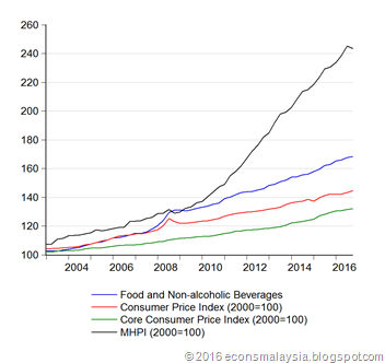
There’s inflation, there’s food inflation, but then there’s house price inflation (quarterly index numbers; 2000=100):

01_indexes

Technical Notes:

  1. Inflation numbers from the Department of Statistics Malaysia
  2. Malaysia House Price Index from NAPIC

Wednesday, April 5, 2017

Effective Exchange Rate Indexes: March 2017 Update

The NEER and REER page has been updated, as has the Google Docs version.

Summary

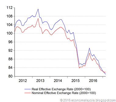
MYR is losing out on the emerging market rally. Both indexes continued to decline, despite stability against the USD. There was a slight uptick in the Nominal Narrow Index (top 5 trading partners), but the Real Narrow Index dropped 0.26%, as inflation accelerated faster in Malaysia. The Real ASEAN index dropped the most month on month (-0.76%), but having said that, March marks the first time this particular index has dropped below 100 since June 2000.

Despite this, on a bilateral basis, MYR appears to have turned around, or at least stopped losing ground. Gains were recorded aganst 9 out of the 15 currencies in the broad basket. The nine-month losing streak against the AUD finally ended (+0.65%), with the biggest gain coming against the GBP (+1.31%). The biggest drop was against the INR (-1.65%), followed by the TWD (-0.61%) and KRW (-0.58%).

One last thing: The indexes have crossed, with the NEER now above the REER. This is largely due to inflation in Malaysia accelerating faster than our peers. Technically, if you believe this stuff, that indicates the MYR is now overvalued, though I’d reserve judgement until I get a chance to take into account nominal interest rates as well (standard UIP model).

01_indexes

Changelog:

  1. Indexes have been updated to March 2017
  2. CPI deflators and forecasts have been updated for February/March 2017

Tuesday, April 4, 2017

Chart of the Week: Core Inflation and the Impact of GST

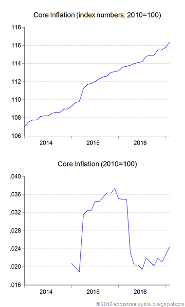
I was struck by a graph I saw the other day, and I’ve tried to reproduce it here. This is the still relatively new Core Inflation Index from DOSM (index numbers, log annual changes; 2010=100):
01_core

The graph of the growth (inflation) of the index is truncated because that’s more or less what’s publicly available, but trust me that the longer series shows core inflation at roughly 2% for the two years prior.

This shows very, very clearly the impact of GST, and fulfills the prediction I made nearly four years ago – GST caused an upward shift in the price level, but didn’t cause inflation (as narrowly defined by economists) to rise. It was purely a price level change, and didn’t change the slope of the index. The impact appears to be a roughly 1.8% peak to trough increase in the price level, in line with the MOF/BNM forecast.

Core inflation is currently appearing to accelerate, but that can’t be ascribed to the imposition of GST, which after all happened exactly two years ago.

Technical Notes:

Data from various Consumer Price Inflation reports from the Department of Statistics. NOTE: DOSM’s core inflation index excludes both highly volatile prices (certain seasonal foods such as vegetables) as well as petrol prices (which have been very volatile since the float in 2014). It also excludes prices of goods that are “administered” i.e. those whose prices are either fixed by the government (e.g. rice), or move due to changes in government tax policies (e.g. tobacco and alcohol). Therefore a presents a truer picture of underlying price pressures in the economy. Note that this doesn’t mean stuff doesn’t get more expensive, it just takes away the volatility in inflation, which makes it more useful for policymakers such as BNM.